Roll With the Punches
The Art of Applied Visual Thinking
The official newsletter of Applied Visual Thinking SUPERHEROES. Vol. 3 No. 18 September 23, 2022
Sometimes life throws you a curveball. That happened to me last Saturday. I was all tucked in with my coffee and art supplies in my office, headphones on and family occupied in other rooms. I was looking forward to joining an art class over Zoom. Not fifteen minutes into the class, my youngest son informed me that our dog, Kade, had a cut on his leg. It wasn’t terrible, but it didn’t look good.
OK, I thought. I am frequently teaching about building resilience and learning to roll with the punches. This was the punchy part. More distressing than the inconvenience of having to duck out of most of the class were the questions of what to do to care for the dog.
- Treat him at home or take him to the vet?
- Could we could even get an appointment
on a Saturday? - What should we to do if it became infected
over the weekend?
In talking about these various concerns with our veterinarian, a local urgent care vet and my husband, other factors emerged such as the time involved (we had a busy day planned already) and cost.

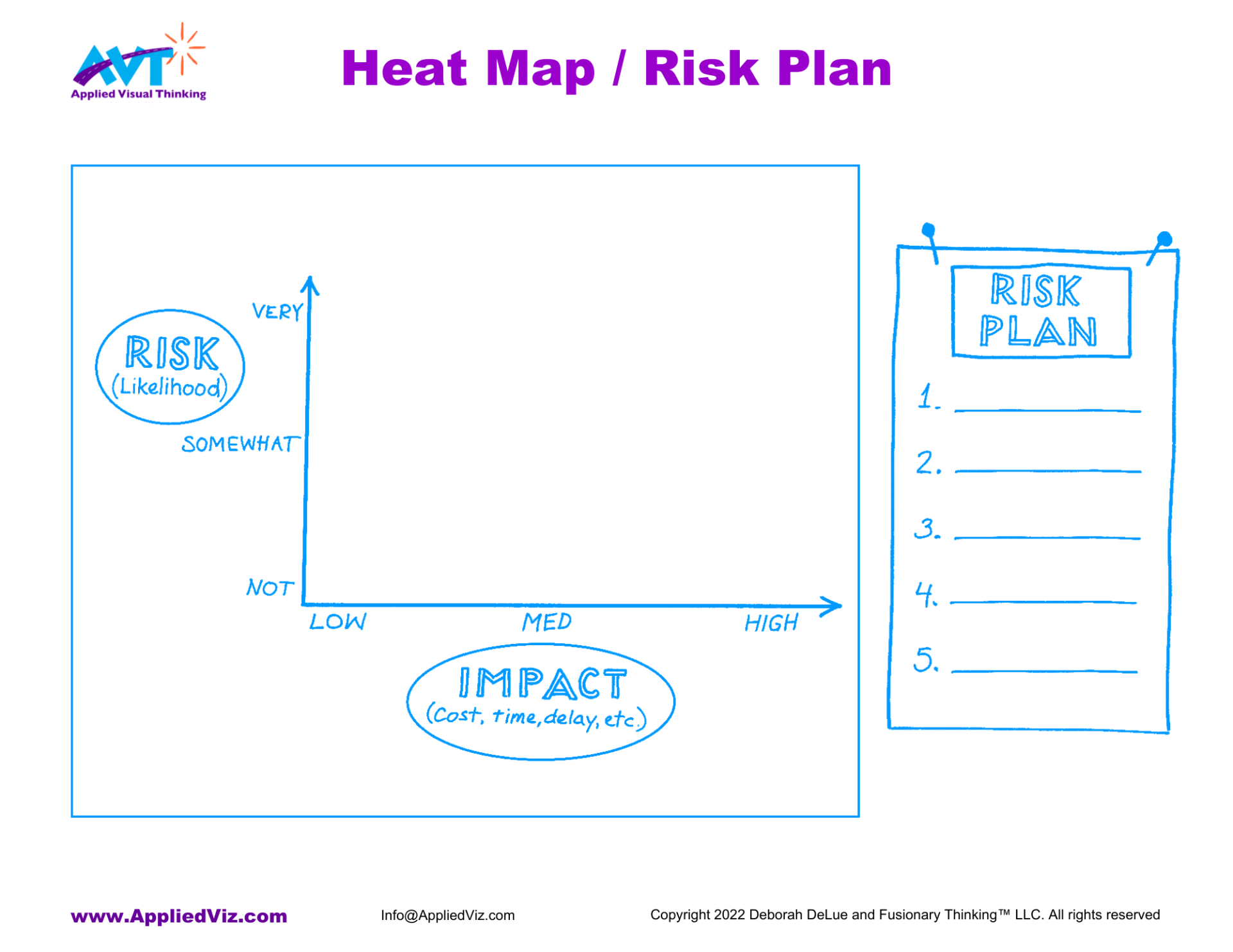
I was reminded of the Heat Map Debbie introduced me to when we were developing the Applied Visual Thinking for Project Management course. It’s a simple but powerful way to capture the risks associated with a decision and their comparative impacts to their impact (positive or negative). I created a heat map to show the main concerns in this story. I used color coding to differentiate between the two options we were considering — taking the dog to the vet for stitches or treating him at home.


What was the outcome? After quickly visualizing the risks and possible impacts, we decided to take Kade to the vet for stitches. We thought the possible benefits of faster healing and lower risk of infection were worth the costs.
This was a personal example but these kinds of complex assessments happen all the time in business, too. Should I outsource my data management? Grow my business by hiring, finding a partner or outsourcing? This is one way to map the risks. There are others. When you are trying to present information visually, remember to align your drawing with the most important takeaways. Just as there can be "bad data," poor visuals leave you with incorrect messages.
Whether the decisions are personal or business relate, I find that
thinking through the potential risks visually helps me see them more clearly and thoroughly. Armed with this knowledge, I can create a risk plan like this one to mitigate the risks that have the greatest potential for harm. This is the “tuck and roll” that brings me through unscathed.
Have a risky problem you need to resolve? Download this free Heat Map & Risk Plan template and play along.
- Make a list of the possible risks you can imagine.
- Select the top 3-5 risks. For each, consider how great the risk and impact is - low, medium or high. The higher a risk is plotted on the vertical "Risk" axis, the more likely it is to occur. On the horizontal "Impact" axis, the farther to the right, the bigger the impact would be in terms of cost, time, delays, etc.
- Plot each of your selected risks on the Heat Map.
- Consider which of the risks are most worth the time and energy to mitigate. Most likely these will be found in the high risk, high impact quadrant of the map (upper right). Create a short list of simple actionable steps you can take NOW to mitigate these risks.
Share with a friend