The Just-Right Visual
The Art of Applied Visual Thinking
The official newsletter of Applied Visual Thinking SUPERHEROES. Vol. 6 No. 20, September 26, 2025
Planning for What's Next
Over the last couple of months, if you had a chance to read our newsletter on your summer travels, we narrowed our focus to a handful of very basic shapes in our “Shape Shift” series. We explored some of the ways we can harness the power of these simple visual tools. In this next series, will be floating up in a hot air balloon and broadening our view.
We know life is complicated, and sometimes capturing that complexity is necessary. For example, when you’re planning a cross-functional project or one that involves community input, creating and tracking a detailed project plan is essential.
Sometimes, however, we seek the ease that comes with simplifying a project to the high-level summary. Visuals are magic here. Being able to understand where you are at a glance saves time, keeps you on track and allows you to share that progress with others.
Determining
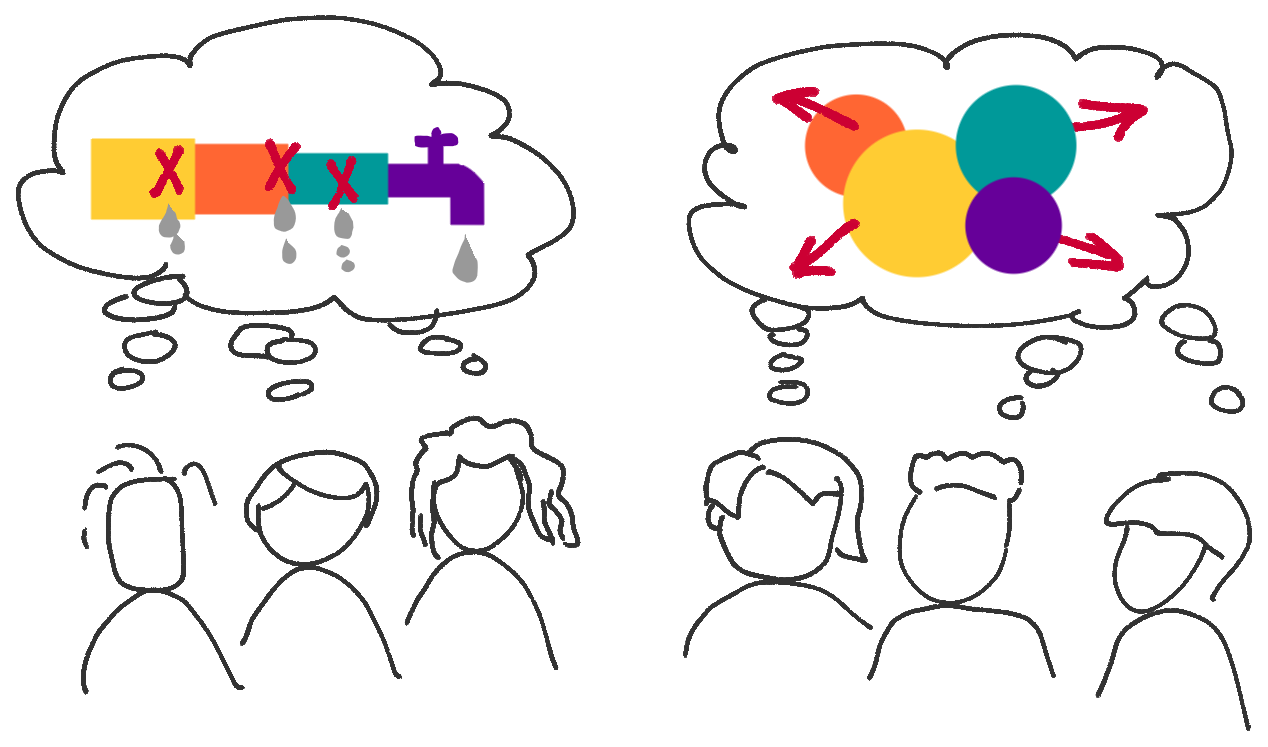
how much information to share and in what format can be a confusing task. No doubt you have experienced a deer-in-the-headlights moment looking at a graph, map or chart that made no sense to you no matter how long you stared at it. Perhaps you have also experienced the frustration of a diagram that so oversimplified, it left you skeptical that there was enough data behind it to give you confidence in its message.

As in the classic story of Goldilocks and the Three Bears, you and those you want to communicate with will be most comfortable if the visuals you create don’t have too little content, nor too much, but rather
juuuuust right.
Where should you start to create the just-right visual?
We are preparing to launch not just one series, but a set of series that will dive into this very question and more. We will peer deeply into some practical ideas for combining those shapes into powerful tools you can use to reduce complexity, understand problems, generate solutions and share ideas.
As a place to start, here is a quick template you can use to kickstart your thinking, however you plan to use your visual superpowers. Think of this as a pre-planning exercise before you dive into the actual making of your visual.
Try This:
This template is especially useful when you are preparing to create a visual that will be shared with others and is intended to communicate something of importance. This scratch-sheet is intended to help you pre-sort your ideas for what could be included in your visual so you can narrow down the list to just what should be included for the biggest impact.
- Download and print the "Just-Right" template.
- Add a title to the top that describes the specific focus for your visual, such as "Agenda Template for Weekly Meetings" or "Onboarding Process".
- Using the questions as prompts, jot down your ideas in the relevant section:
- Too little
- Enough
- Too much
Want to make this a group activity?
Copy or print this template HUGE and have the group generate and sort their ideas using stickies.

Examples
Here are a few examples of how you might respond to each of the prompt questions:
- Who is the audience and what's their level of expertise? Is your audience subject matter experts, new to this information, somewhere in between, or a mix? For a technical process map: too little skips crucial steps non-experts need, too much includes insider jargon, just right bridges knowledge gaps without talking down.
- What might the audience need to know? For a project summary visual: too little shows only project phases, too much includes all tasks for each phase, just right shows key milestones with deadlines and responsible groups.
- How will the visual be viewed? (large/small, on phones/screens, email, social media, presentation, etc.) For a budget update PDF: too little offers figures without context, too much creates unreadably tiny spreadsheets, just right is understandable at a glance yet detailed enough for closer review.
- How much time will viewers have with your visual? For a presentation slide: too little provides numbers without context, too much overwhelms with paragraph-heavy content, just right can be absorbed in the time allocated while supporting the speaker's message.
- What is the one key takeaway from this visual? For any communication: too little leaves viewers guessing the point, too much buries the message in competing details, just right ensures all elements support a single clear story.
- What might the future of this visual hold? For a process diagram: too little lacks necessary details, too much becomes unwieldy to update, just right builds in flexibility for expected modifications while staying focused on current needs.
Closing Thought
Visual thinking doesn't have to be complicated—it just needs to be intentional. By taking a few minutes to sort through what belongs in your "too little," "enough," and "too much" categories before you start creating, you'll save time and create visuals that actually work for your audience. Remember: the goal isn't perfection, it's clarity.
Thank you for joining the Applied Visual Thinking family. We look forward to hearing from you what works for you and where you'd like more ideas for applying your visual thinking superpowers. Email us your ideas, questions, comments and stories!
Share with a friend